I have been thinking of different names for the cover of my magazine that sounds catchy and attracting.
I have come down to 3 different mast heads that I would like the name if my magazine to be.
I have come down to 3 different mast heads that I would like the name if my magazine to be.
|
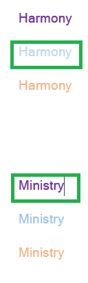
For my music magazine, I have decided that it could be called 'Harmony Magazine' but 'harmony' for short because not only does it have a ring to it, the sounding to the name is smooth and innocent. The name not only sounds interesting but it tells the audience that this specific magazine is music related. Harmony resembles music in a soft and simple way. It is simple, obvious but out of the blue as well. This is also the reasoning for why I chose the colour blue. Blue is a neutral colour and although my target audience is for teenage girls, I wouldn't mind teenage boys looking at the magazine too. This shade of blue resembles what I want the feel of the magazine to be.
My other option for my music magazine is for it to be called 'Ministry Magazine' but 'Ministry' for short. Although Ministry is a multimedia business, it has an in depth music feel that feels like it is appropriate for all genres. My music magazine is for the pop genre specifically so it goes with it a bit. I have chosen the colour purple because my target audience, I have decided for it to be teenage girls. I didn't necessarily want to go with the stereotype of pink, so I chose the one that closely resembles the colour that is also, in a less obious way, stereotypically for girls too. For both mast head's, I made the font be 'Latha' which is one of the fonts I chose in my 'Target Research' page. Also, I had the size go to 16 which I thought would be big enough for it to be a mast head size. But, with all these research that gives me a view on what things would look like that in reality, I feel like the mast head should be a bigger size to make it more attracting and obvious on what the aim of the mast head is trying to achieve. |
