target research
I have made a target research questionnaire in order to understand the target audience better and to know what they like, don't like or prefer.
https://www.surveymonkey.com/s/DXRQGQN
https://www.surveymonkey.com/s/DXRQGQN
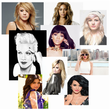
moodboard
|
My music magazine would be targeted to teenage and young adults who are females. The magazine would be based on pop culture genre. I have created my mood board by checking what people have suggested that they would like within a music magazine. The majority of the voters who went and answered the questions on survey monkey said that they would be more likely to by a magazine with a close-up shot of the singer's face to create seriousness and to lure people towards that magazine. Also, I have noticed that people prefer it when the singer's hair is down to show more of their feminine side as there would be a wider ranger of hairstyles done to show diversity within what genre of music they suite. This also supports the make-up that they have, whether its neutral or heavy to represent their music persona more. I need to look into what type of background i would want behind my model and how this would relate to my theme, also their clothes and accessories needs to be taken into account.
|
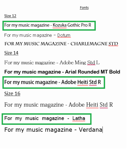
Fonts
|
The fonts that I have chosen (to the left) I believe would suit the magazine genre that I want to create for my magazine. I have chosen three different fonts for each size to give me a fair choice in what I thought would look good for my magazine and to attract my target audience the best.
I have chosen the first choice for size 12 to be a possible choice for a font. 'Kozuka Gothic Pro R' seems like a simple yet sophisticated font and for it being a size 12 compliments the style of the font as well. I didn't choose the other two fonts because I found that they were too plain or too fancy and classy to go onto my magazine page. For the size 14 fonts, I have chosen the last choice as I like the boldness to it so it makes the font more attracting and eye-catching than the other two. The first choice for this font size wasn't the best font to choose as it isn't appealing as I thought it would be. The middle choice suddenly looks too bold and many magazines use the font Arial Rounded Bold for sub-headings and it looks too original and common. Most magazines that I have analysed seemed to have the common fonts to not draw too much attention to it and more attention to the important areas its trying to discuss. For the last size, size 16, I decided that the middle choice 'Latha' was a good choice as it seemed like a different font compared to the other fonts that I have previously chose. The letters are more spaced out so it looks more clear so it is easily read than the other font types. I would have gone for 'Verdana' for similar reasons but something drawn me closer to Latha. Adobe Heiti Std R is a good, clear font type for me to use but it seems to be too formal and boring at the same time which I do not want for my magazine. |
