
|
For this double page spread, you can see a woman posing for the camera but usually you don't see the 'behind the scenes', whereas in this double page spread you can. This gives off a professional atmosphere to the readers and also to let the readers see what its like. It spreads over two pages to emphasis how much effort and work goes into production and it shouldn't be expressed just over 1 page. the model is posed slanted to the side to show a fun, different, unique side to everything. On the next page, you have all the text and the story to go with the picture. the title is bigger, bolder, posher than the other text to make it eye catching, attractive and luring to the audience. The way that they made it black makes it look simple but at the same tine unusual. The text for the main story is smaller to show that it is important and relevant but the magazine doesn't want it to be the main attraction. in the bottom corner you can see bit more of a story but its to the side and out of the way and it looks more like a newspaper article, the black and white colours for it looks boring and plain but at the same time interesting if its on this double page spread. The yellow coloring at the top right area gives off colour and a kind of brightness and the way its shaped is different and makes you wonder the relevance and reason behind it. The blue background makes the whole of the double page spread look subtle, clear and calm.
|
|
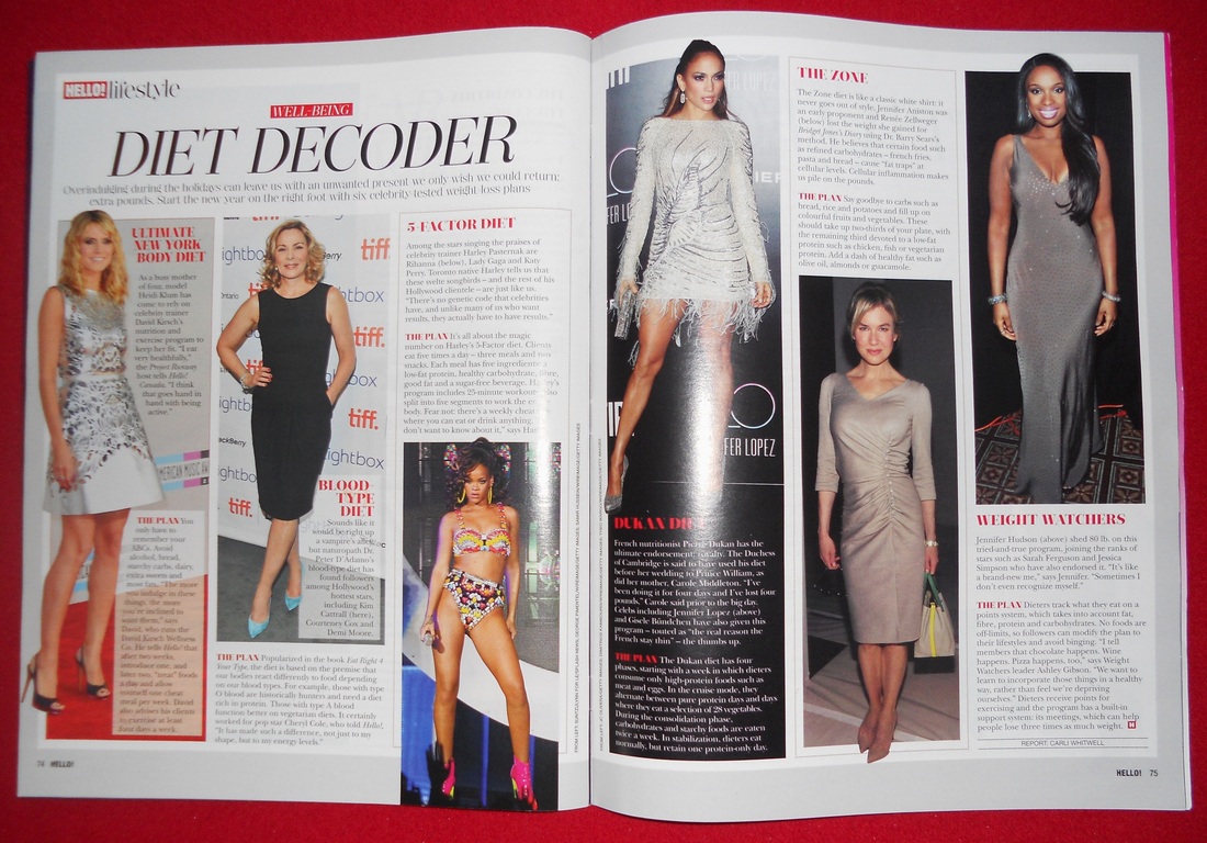
This magazine double page spread shows many celebrities who are all girls to attract their target audience of all range of females. As shown from the title, this article is all about how all these celebrity idols have lost thier weight. This would either peak reader's interest or patronise or intimidate the reader making them feel bad about themself. However, many readers would not envy these women as they are living the celebrity lifestyle. Also editors would have prefabrecated the magazine to make it look more appealing for their target audience. The layout of the double page spread makes the article look more interesting; changing the sizes of the pictures to make the larger ones more important and engaging than the smaller ones. The pictures on the left page look more brighter and light than the pictures on the right page making them look mysterious in a way. This is to emphasise which 'Diet Decoder' should be recognised the most. Also, the women's dresses are similar colours, size and length which shows off their body figure more.The title is big and noticeable so its the first thing that the reader's can see to make them know what the double page spread is about. The sub heading's for each celebrity's diet plan is in red and bold next to each picture whaile the actual articles are in normal black print.
|
|
|
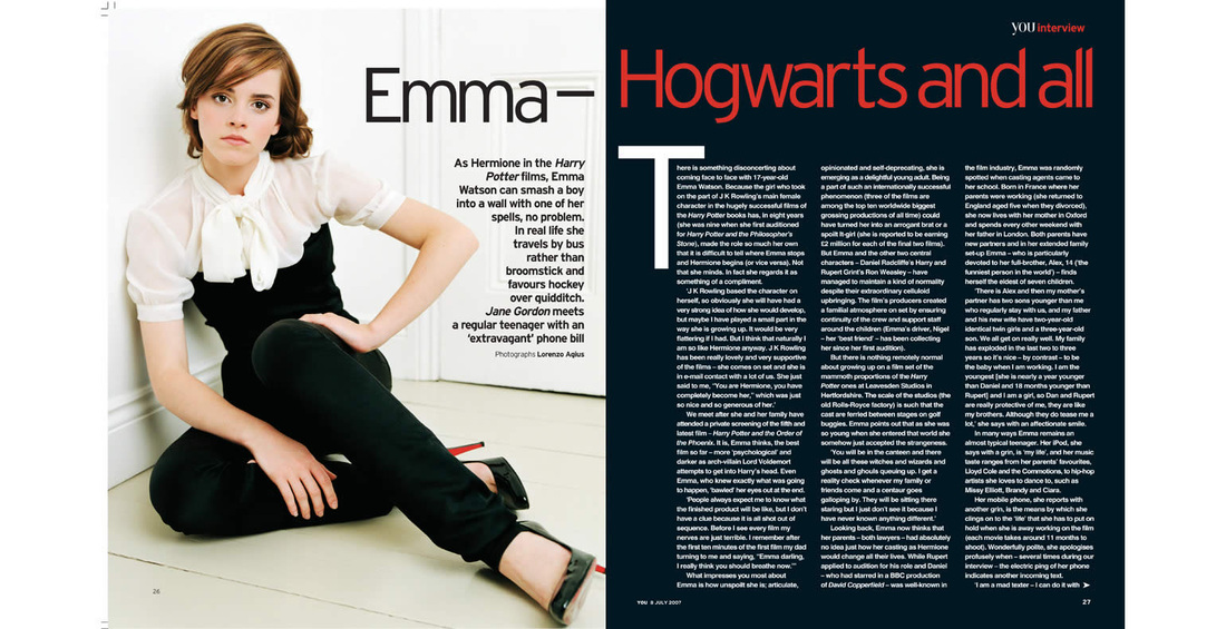
Emma Watson is the main focus for this double page spread. The way she is posing is more of a casual position and she is in the corner of a white room on the floor to make her clothes stand out. Her whole outfit looks stylish, formal, expensive and contemporary which is what you would expect someone like Emma Watson to wear now since her fame from the Harry Potter series. Her facial expression is serious and she connects with the audience to say that she isnt the little girl that everyone saw her as, that she has moved on and she is sincere about where she is in life. Her makeup looks natural and fresh like her whole appearance, personality and talent. The colour the left hand side of the page is mainly black and white which is viewed as simple but in this case it looks more sophistcated and practical. On the right hand side of the double page spread, you have the colours blue, white and orange which are more like school colours; which relates to the title of 'Hogwarts' - the fictional wizard school from 'Harry Potter'. Having the title in orange gives a splash of colour to the page and makes it look more individual and eye-cathing. The actual article is in white font colouring to make it clear, readable and bold but also common at the same time.
|
