
|
This double page spread appeals to me as it does what I want on my double page spread that I will produce; a mid-shot of my model for one side of the page and the text on the other side of the page. I like the colour theme for this double page spread too; grey and yellow, which reminds you of a daisy, as shown in the corner of the page. The grey resembles Carrie Underwood's dress that you can just about see and the yellow clearly relates to her golden blonde hair that is professionally done. I also like how there is a quote from the singer herself before the whole article begins, to give the audience a taster of what the story will be about and what type of person Carrie Underwood is. I really like the colour, positioning and editing of this double page spread as it gives me a lot of inspiration for when I begin mine.
|
|
This double page spread gives off a totally different vibe from the previous one I have analysed. As before, I want my model on one side of the magazine and the text on the other which this magazine clearly does. The model shown has more of a goth/emo look which is attracting and also it looks sexualised as the model is wearing leather with an appealing pose. I also like the way that her hair stand out from the dark edgy background as it shows more of her personality and the personality of this magazine/article too. I didn't expect pink to match this type of theme but at the same time, even without the pink colouring, the audience could tell that it is targeting women and girls - the pink just adds to the stereotype. The title 'Wild Child' seems to be expected because of the layout and theme that the producers have went for, but at the same time, you wouldn't expect the title to be that as it seems too obvious. That is what I like about this double page spread the most. The whole this is done in an obvious way, but you wouldn't expect it to be obvious in a magazine too. That is what I imagine to happen for my double page spread, for my mast head title to be obvious but in an unobvious way.
|

|
|
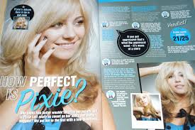
I like this double page spread as it goes against stereotypes and the common layout. As shown previously in the other two double page spread, it has one picture of the model, then the text. For this magazine, however, it has two pictures of the model and singer Pixie Lott as she tries to promote what the magazine or a specific company are trying to sell, which is clever to do but not uncommon. It goes against the stereotypes for girls as normally, for a magazine that is aimed at girls, the audience would expect to see the colours; pink, yellow, orange. The colour blue seems more of a masculine colour - but it works well with this double page spread. That is what I Iike about this double page spread, it goes against stereotypes, even though the clear main target audience are females which is shown by using a female as a model, I want my magazine to be different and unexpected but in a way that the audience would notice but admire too.
|
