
|
This Marie Claire contents page is presented by applying the colours white, red, and black. The master head, 'Marie Claire', are in lower cased letter's; to show informality and difference than the alternative sub-titles and sub-headings. 'Marie Claire' is bold and black; displaying the magazine name and to remind the reader's what magazine they are reading. The sub-heading 'Contents' is in capitals to emphasise the page and to show the audience what topics are in the magazine and also to expose their attention into the areas within the magazine. 'Contents' is in red to add colour to the page and to engage the readers. The background colour is plain white, so the reader doesn't have too many colours displayed to them. Each topic, story and article is number-pointed according to what page the audience can find them on. Also, the font colour is black to stand out on the white background so its better to read. Adding the big, red circle ties all the colours together and it's one of the first area of the page that you would see. It is eye-catching and the heading for the circle '101 Ideas' sparks an innterest in the audience making them read on. The main focus of the contents page is the picture of the woman posing. This is to express the fashion side of this beauty magazine. Leaning on a post with a hand on her hip symbolises casualness, facing sideways away from the camera. The clothes she's wearing is seasonal with black as the main colour for her outfit including a blue, white and black striped shirt creates a stylish, day-time, casual look. The scenery around her links to the idea of casualness and normailty and not like other magazine's with advanced staged settings.
|
|
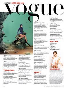
For this Vogue contents page, the title vogue is in lower case letters but the font size is big, bold and black which is a main classic colour that stands out on any other coloured background. There are different topic areas for within the magazine to help spark an interest in the readers; for example 'vogue stars' and 'beauty'. There is also two pictures in different areas of the contents page; one is very noticeable, large, coloured and the main attraction of the contents page. Also, there is a picture of a model posing to represent a part of a topic of the magazine. The model is wearing a swimsuit type of clothing as it matches with the fish/aquarium theme which is set up behind and around her, this supports the idea of the reason she is wearing flippers and that her costume is blue. The layout of the text goes around the pictures and the text is small and black which prevents it offending the reader's eyes.The sub headings for the different topic areas are in a bright red colour to stand out on the page to make it noticeable that there are other topics inside this magazine.
|
|
|
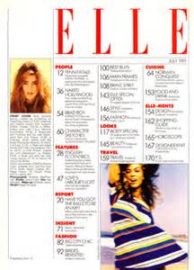
For this Elle magazine, the title 'Elle' has the letters spaced out to present the title more clearer. The font colour - red, is usually an attractive colour and also it suites both gender's so it is not stereotyping. However, the problem by doing this is that Elle is usually referred to as a 'women's magazine' so men wouldn't be seen reading this type of magazine. Also, there are two pictures of girls on this contents page so you instantly realize that it's a feminine magazine. The lighting on the first smaller picture makes the surroundings look calming and relaxing and this compliments the way the woman looks. However, the woman in the larger picture looks like she is posing more and looks more fun. The way her arm is behind her head is making it clear that she is posing and not just doing it for fun. The stripy dress makes you instantly imagine that she is on the beach during the summer season. The layout of the text and sub headings is in a specific order. The sub headings is in red which matches the title 'Elle' so the font and colouring compliments each other. Every topic under a sub heading is bullet pointed with the page number that it is found on helping the reader's find what they want to look for easier.
|
